At the turn of the century, UMO.Design launched the Boycott Bad Designs campaign—an open call to expose poorly designed products and services affecting our daily lives. From elevator buttons that do nothing to apps that crash at the worst moments, the campaign struck a nerve and became an annual tradition, inviting people from all walks of life to look at the world through a design-aware lens.
Fast forward 25 years, and bad design is still around—but it’s wearing new clothes.
To mark UMO’s 25th anniversary, we’re relaunching the campaign with a sharper, broader focus. It’s not just about bad designs anymore. It’s about bad experiences—the kind that waste your time, drain your money, or even put your safety at risk.
In an era of smart tech, AI interfaces, and immersive services, there’s no excuse for frustrating, confusing, or thoughtless experiences.
Accessibility
In Design
Good design includes everyone.
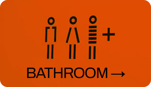
Accessibility isn’t a feature. It’s a fundamental responsibility. When products and experiences are not designed with inclusivity in mind, they can exclude millions—people with visual, auditory, motor, cognitive, or other impairments. Inaccessible design is bad design. Whether it’s a button that’s too small to tap, a form that doesn’t work with screen readers, or an app that relies solely on color to convey information—it all adds up to experiences that leave people behind.
As part of our Boycott Bad Experiences campaign, we encourage you to highlight moments where accessibility was overlooked—and inspire a shift toward designing for all. Let’s build experiences that welcome, include, and empower—because inclusive design is better design.
At UXINDIA and UMO.Design, we believe:
If it’s not accessible, it’s not usable. And if it’s not usable, it’s not good design.
What We’re Looking For
We’re calling on the community — designers, students, professionals, everyday users to capture and share real moments where design fails real people.
Your entry could be:
A photo of a confusing product or sign
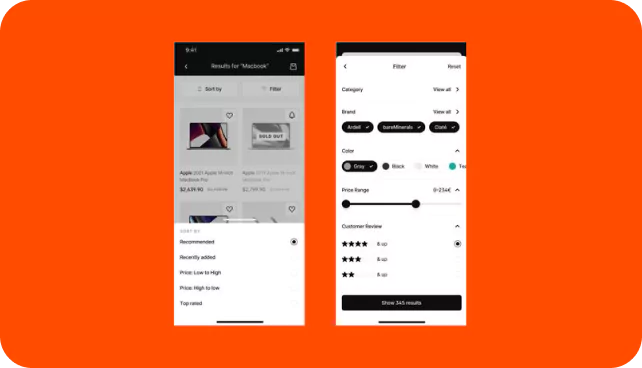
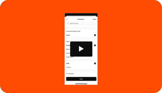
A screenshot /series of screens of a frustrating digital interface
A video recording that demonstrates a bad/frustrating design.
Whether it’s physical, digital, or somewhere in between, the key is to show the moment when a user experience turns sour.
Awards
And Recognition
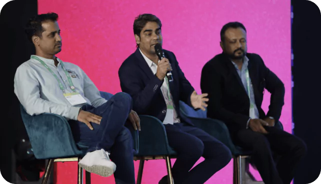
Top 20 submissions will be exhibited at UXINDIA 2025, India’s biggest design conference.
These entries will be showcased for live voting by the audience and a jury panel.
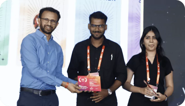
The Top 3 entries that best capture user emotion and highlight poor experiences will receive free tickets to UXINDIA25.
Submission
Guidelines
EVERYONE
Students, professionals, and design enthusiasts
Format
Photo / Screenshot / Video (max 1 min)
Quantity
Engage directly with attendees from Fortune 500 companies and innovative startups.
Why Participate?
You’ll help raise awareness around the impact of poor design.
Your entry could spark meaningful conversations about accessibility, usability, and empathy.
And let’s face it — you’ve always wanted to publicly roast that one website, app, or badly placed sign.
Need
Inspiration?
Think...
Menus with too many choices (and no logic)
Machines that need a PhD to operate
Buttons that lead nowhere
Instructions that make no sense
Or that one app that made you cry...
Submit
your Entry
Spotted a bad experience?
Show us what went wrong! Whether it’s a frustrating app, a confusing sign, or a moment of complete design failure—this is your chance to call it out.